Reinventing the Wheel?
Building on Other’s Experience and Skillsets
Collective Knowledge and Learning
Wet Palette Use № 2
From time to time we come across reference pictures of subject matter we want to recreate. Because they are very well done, we want to be able to emulate them in our own work.
If we are inexperienced, it can be really tough to figure out what colour goes where and in what order. ![]()
Using a wet palette, the identified reference colours are organized and mixed on the hydrated parchment paper to recreate the desired look. Better still, the colours will remain usable for some time to come. ![]()
Like oil paint, acrylic paint, water-based, is both additive and subtractive. Mistakes are super simple to correct, remove or modify… easy-peasy.
Using a wet palette not only accelerates our learning curve while adding to our skillsets but increases our colour comprehension too.
By keeping a log of the colours used, they can always be referred back to for future use. There is no need to reinvent the wheel. ![]()
Worried about a cookie-cutter look? Each project will differ slightly as the exact ratios and mixes will differ.
Lesser artists borrow, great artists steal.
— Pablo Picasso

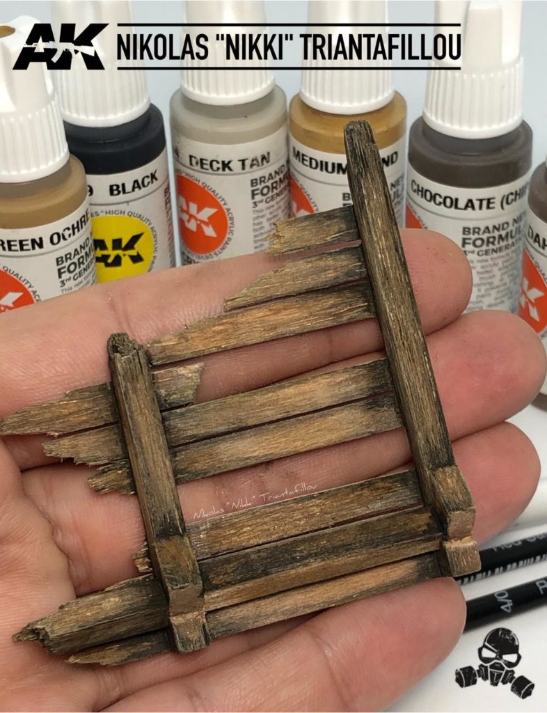
3Gen Colours
- Green Ochre: AK11122
- Black (Ink): AK11029
- Deck Tan: AK11114
- Medium Sand: AK11034
- Chocolate (Chipping): AK11113
- Dark Rust: AK11107
![]() Ignore names and look for the colour. Any water-based acrylic paint brand can be substituted within the same tonal and colour value range to achieve similar looks.
Ignore names and look for the colour. Any water-based acrylic paint brand can be substituted within the same tonal and colour value range to achieve similar looks.


